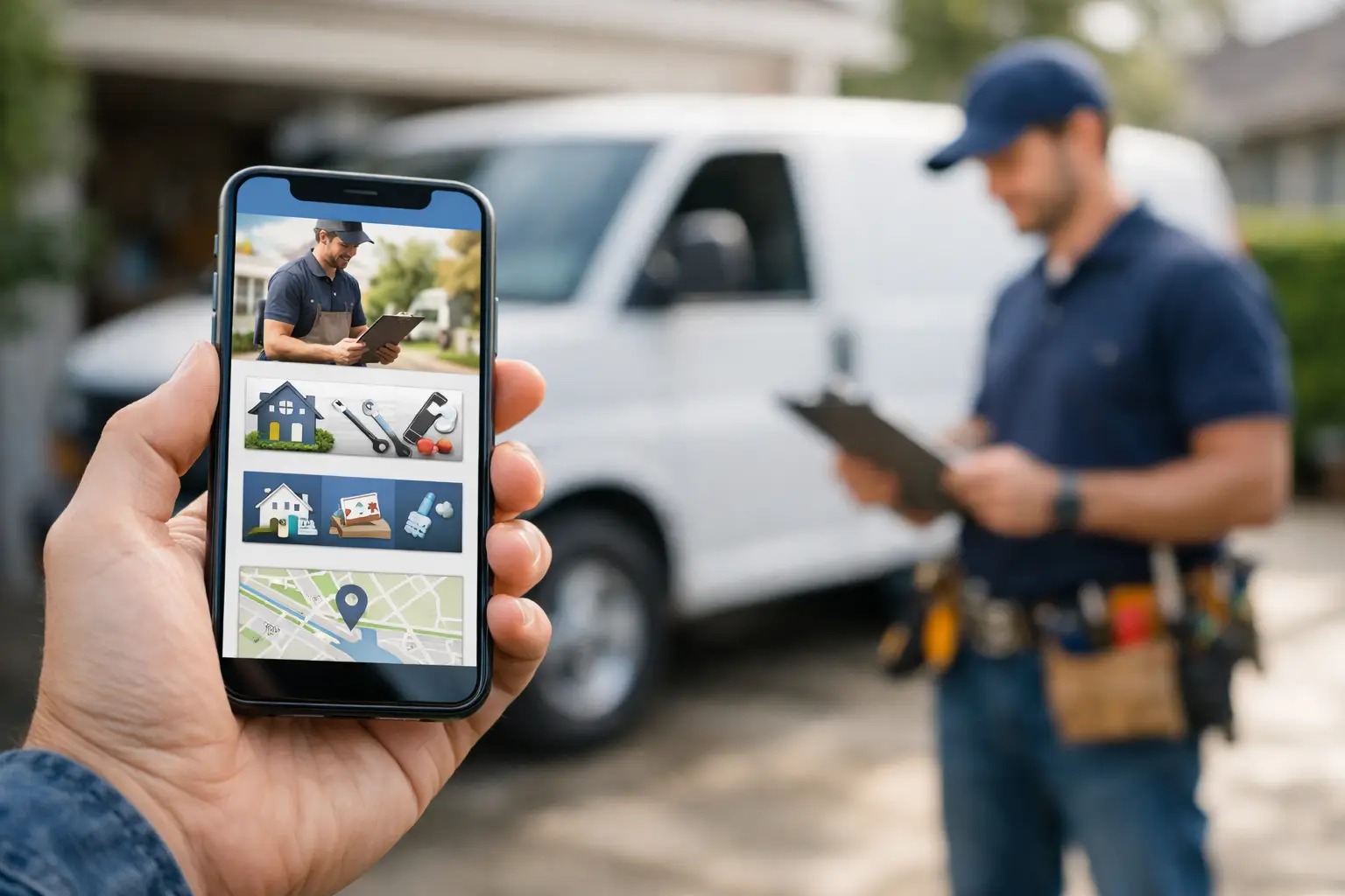
Someone finds your business on their phone, taps your site, and waits three seconds for the page to load. If the phone number is hard to find, the text is cramped, or the quote form feels like homework, that lead is gone. A mobile first website for local services is not a design trend. It is the difference between getting the call and funding your competitor's month.
For local businesses, mobile is where intent shows up. People searching for an HVAC repair, dentist, roofer, attorney, or restaurant are often not researching for fun. They need an answer, a price range, a schedule, or a direct way to contact someone now. That changes how a website should be built.
Why a mobile first website for local services wins more leads
Most local traffic now starts on a phone, but many small business websites still behave like shrunk-down desktop pages. They look acceptable from a distance, yet they force users to pinch, hunt, scroll, and guess. That friction kills conversions.
A mobile first website for local services starts with the smallest screen and the highest-intent visitor. Instead of asking, "How do we fit everything on mobile?" the better question is, "What does a ready-to-buy customer need in the next 10 seconds?" Usually the answer is simple: trust, clarity, and one obvious action.
That action might be calling your office, requesting a quote, booking an appointment, checking service areas, or getting directions. If those actions are hidden under animations, giant image banners, or vague menu labels, your site is working against your business.
This is where a lot of agencies miss the point. They build for approval, not performance. Local businesses do not need digital theater. They need websites that reduce hesitation and make it easy to take the next step.
Mobile-first is not the same as mobile-friendly
A mobile-friendly site technically works on a phone. A mobile-first site is planned around phone behavior from the start. That sounds like a small distinction, but it affects everything from layout to copy to page speed.
When a site is built mobile-first, the headline gets sharper because there is less room to ramble. The call to action gets stronger because it has to be visible fast. Navigation gets cleaner because bloated menus break down on small screens. Forms get shorter because every extra field costs completions.
For local service businesses, that discipline matters. A plumbing company does not need a homepage that reads like a brand manifesto. It needs a homepage that tells people what you do, where you work, why they should trust you, and how to contact you without friction.
What high-converting mobile pages actually do
The best local service websites on mobile feel obvious. That is a compliment. Visitors should not have to figure anything out.
The first screen should answer four questions quickly: what you do, who you serve, where you operate, and what the user should do next. If you are a personal injury lawyer, say it. If you are a dentist accepting new patients in a specific city, say it. If you offer same-day HVAC repair, put that front and center.
Strong mobile pages also prioritize tap behavior. Buttons need enough size and spacing to avoid misclicks. Phone numbers should be click-to-call. Forms should ask for only what the business needs to qualify the lead. Reviews and trust signals should appear early, not buried near the footer like an afterthought.
There is also a speed factor. Heavy sliders, oversized videos, and decorative effects often look expensive but perform poorly. On mobile, every extra second creates drop-off. For a local business owner, that means ad dollars wasted, search traffic squandered, and fewer booked jobs.
The pages local businesses usually get wrong
Homepages get the most attention, but service pages are often where conversions are won. A roofer should not rely on one general services page if the business wants leads for inspections, repairs, replacements, and storm damage work. A med spa should not force mobile visitors through broad, unclear menus to find one treatment.
Each core service needs its own focused page built for intent. On mobile, that means a clear headline, short explanatory copy, proof, location relevance, and one direct conversion path. Not five competing buttons. Not a wall of text. Not generic claims with no specifics.
Contact pages are another weak spot. Too many local sites make people work to reach them. On a phone, the contact experience should be immediate. Keep the phone number visible. Keep the form short. If hours, service areas, or response-time expectations matter, state them clearly.
And then there is the menu. If your mobile navigation looks like a filing cabinet, it needs work. Most local businesses can simplify dramatically without losing useful information.
What this looks like by industry
The right mobile-first strategy depends on how customers buy.
For restaurants, mobile users often want menus, hours, reservations, and directions. If those items are not accessible in one tap or two, the site is costing covers.
For law firms, people need confidence fast. Practice area clarity, proof points, geography, and a frictionless consultation request matter more than polished animations.
For HVAC, plumbing, and electrical companies, urgency is a major conversion factor. Call buttons, emergency language, financing details, and service area visibility should show up early.
For dentists, chiropractors, and med spas, mobile visitors often compare options quickly. They want services, insurance or payment info, trust indicators, and an easy booking path.
For lawn care, pest control, and roofing companies, quote requests are the money action. That means short forms, fast-loading service pages, and localized relevance that helps both conversions and local search visibility.
The point is not to copy another industry's layout. It is to match the site to actual buying behavior.
SEO matters, but only if the site converts
A lot of owners have been sold the idea that traffic is the main problem. Often it is not. Often the real problem is that the site wastes the traffic it already gets.
Yes, mobile experience affects local search performance. Search engines care about usability, speed, and page quality. But rankings alone do not pay the bills. A page that ranks and fails to convert is just an expensive vanity metric.
That is why local SEO and conversion design should not be treated as separate jobs. The same service page that targets a local search term should also make it easy for a visitor to call, submit, book, or request a quote. If the page is built only for ranking, you get visitors without action. If it is built only for aesthetics, you get approval without revenue.
Common trade-offs business owners should understand
Not every mobile design choice is absolute. There are trade-offs.
Shorter pages can feel cleaner, but some industries need more proof before people act. Legal, medical, and high-ticket home services often benefit from stronger credibility sections, even on mobile. The key is keeping the page structured and scannable.
Short forms usually convert better, but if your team gets flooded with junk leads, you may need one or two qualifying fields. The right balance depends on sales volume, service type, and how quickly your team follows up.
Large visuals can build trust when they show real work, real staff, or real locations. They become a problem when they slow the page down or push the call to action below the fold.
So yes, it depends. But the rule stays the same: every element on mobile should earn its place.
What to fix first if your site is underperforming
Start with the basics. Open your website on your phone and act like a new customer. Can you tell what the business does in three seconds? Can you call or request service without hunting? Do the main pages load quickly? Are your reviews and trust signals visible early? Is the copy specific to your services and market?
If the answer is no on more than one of those, your site probably needs more than cosmetic edits.
A serious rebuild usually outperforms patchwork fixes because mobile conversion problems are structural. They come from the page hierarchy, the messaging, the navigation, the speed setup, and the way the site was originally planned. Replacing one button color will not solve a site that was built like a brochure.
That is the bigger shift local owners need to make. Your website is not there to look current. It is there to produce calls, bookings, quote requests, and consultations. If it cannot do that well on a phone, it is underbuilt for the way people actually buy.
Macrolight Builder approaches this the practical way: build for conversion first, launch fast, and keep the site managed so it stays useful instead of going stale. That model fits local businesses because the goal is not endless redesign discussion. The goal is more customer action.
A good mobile-first site does not feel clever. It feels easy. And for a local business, easy is what gets the lead before someone else does.

